Branding
How Relay branding works: accent colour, typography on accent surfaces, themes, and launcher styling so the embedded widget feels native to your platform, builds trust, and supports engagement.
Why branding matters
End users should recognise Relay as part of your product, not a third-party bolt-on. When colours, typography, and the launcher match your brand, the experience feels natural and consistent. That consistency supports confidence, which in turn supports engagement and the outcomes you care about (offers viewed, accounts completed, payouts claimed).
Relay’s branding model is deliberately narrow: we expose a small set of high-impact controls so you can align the widget with your identity without changing core behaviour, layout, or flows. The same screens and interactions stay predictable; only the visual skin adapts.
What you control
| Area | What it affects |
|---|---|
| Accent colour | Primary brand colour used across the widget: header bars, selected filters, active navigation, highlights (for example cashback callouts), and key interactive emphasis. |
| Text on accent | Colour for labels and icons that sit on top of accent-coloured surfaces (for example header titles, balances on the header, launcher label and icon). You can tune this for how your accent reads in light and dark theme so contrast stays accessible. |
| Theme | Default theme (light or dark) when the widget opens. Optionally, end-user theme control: whether a sun/moon control appears so users can switch theme themselves. |
| Launcher | The pill that opens the widget: same accent and text-on-accent treatment as inside the app, plus your label copy and an optional icon from Fruga’s curated set (or no icon). You can also control whether the launcher is shown when your integration uses it. |
Fruga applies this configuration on the server and delivers it to the widget when it renders. Your integration code stays focused on authentication and embedding, not on theme parameters.
Themes: default and end-user control
You choose the default theme for first load. If user theme control is enabled, the header includes a theme toggle (sun in light mode, moon in dark mode). The rest of the chrome and content adapt while accent-driven elements stay on-brand in both modes.
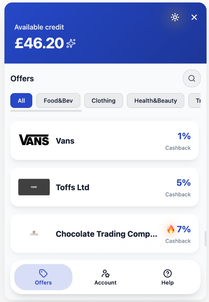
Offers tab in light theme: accent on header, filters, and navigation; cashback highlights use the accent colour.
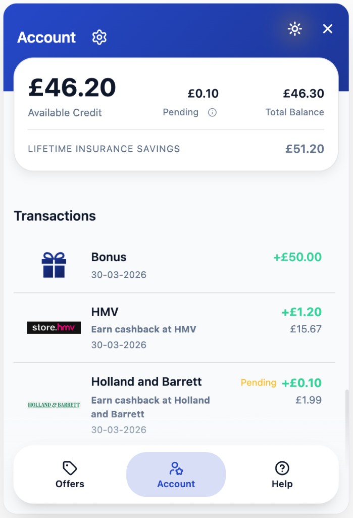
Account tab in light theme: accent on header, transaction highlights, and active tab treatment.
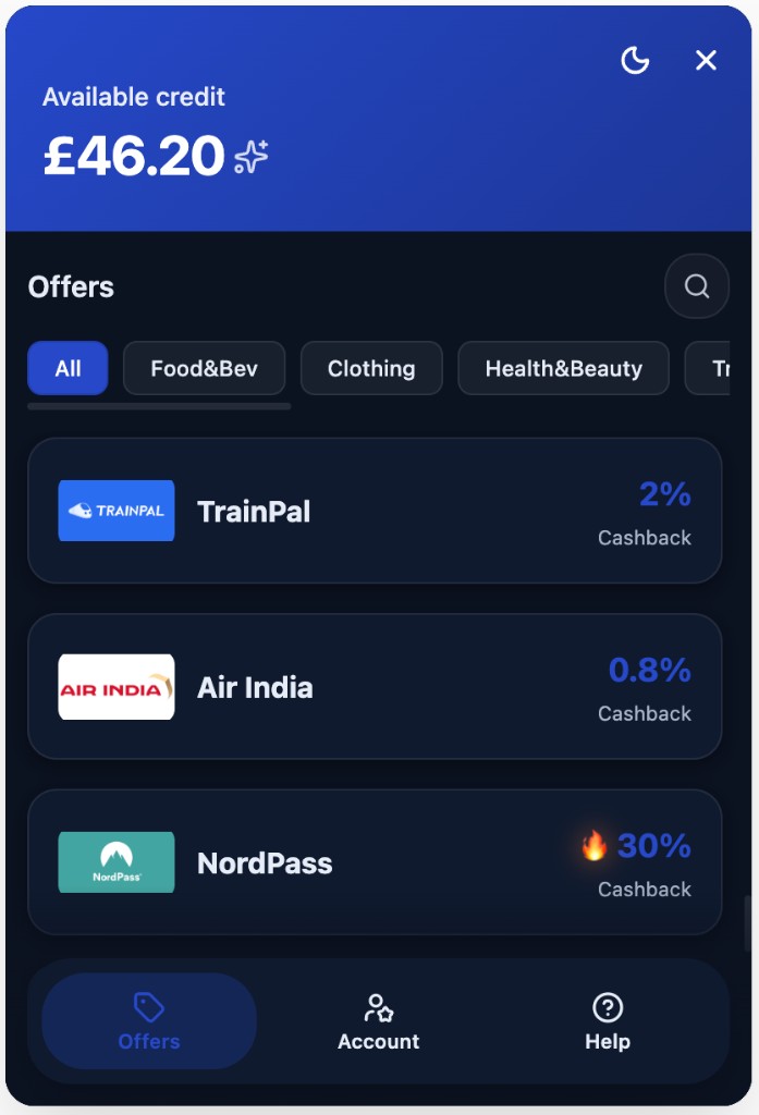
Same accent approach in dark theme: headers, chips, nav, and cashback emphasis stay coherent.
Launcher
The launcher is the first thing many users see. It uses your accent and text on accent settings, your label (for example a savings or rewards message), and optionally an icon from the supported set—or none, if you prefer type-only.
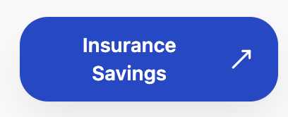
Example launcher with custom label and optional icon.
Design principles
We optimised for simplicity (a few knobs, big visual impact), flexibility (light/dark, launcher copy, icon choice), and sustainability (stable API for your ops team, no fragile CSS overrides in your host page). The widget’s behaviour and information architecture stay consistent across partners so we can ship improvements safely; branding skins those patterns rather than replacing them.
How to change branding
Work with your Fruga contact or use the configuration surfaces provided for your environment to update colours, theme defaults, launcher options, and related settings. Changes take effect for new widget sessions once saved on our side; you do not need to redeploy your frontend for appearance-only updates.